What is data visualization?
Data visualizations are graphical depictions of information and data presented in a variety of formats tailored for industry-specific needs. Data visualization formats include drawings, charts, tables, maps, and more.
Data visualizations can be static or they can dynamically change as the underlying data changes. They also can be interactive.
Often, multiple data visualizations are combined into an organized dashboard to aid analysis and communication of key findings to stakeholders and decision makers.

Common types of data visualization techniques.
Data visualization challenges faced by enterprises
As data grows larger and more complex, enterprises struggle to find effective techniques for understanding their data to identify actionable intelligence and communicate results in a clear way. They rely on Business Intelligence (BI) tools to provide that insight. But these tools often lack the depth and key capabilities for enterprises to truly benefit from their data.
Enterprises need to find the key elements and patterns in their data. They need flexibility to explore related data. And they require the ability to usefully organize and visualize the findings. Only then are they free to determine the implications of that information.
With effective data visualizations, enterprises are able to discover and act upon insights to optimize the performance of their systems, reduce vulnerabilities, and create strategies to reach objectives.
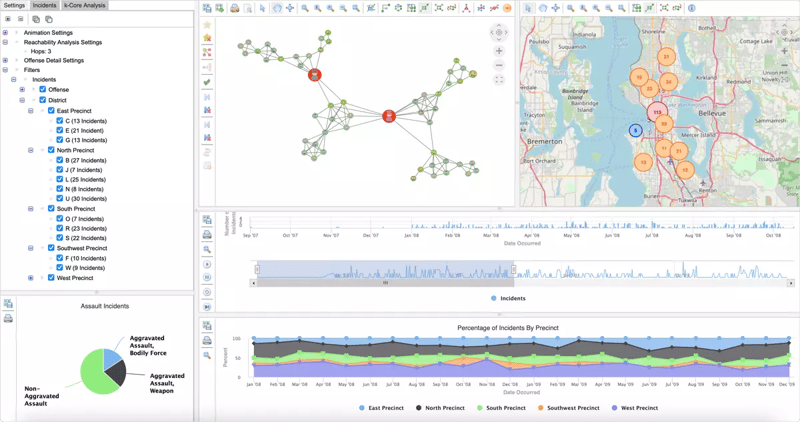
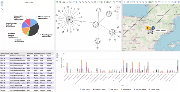
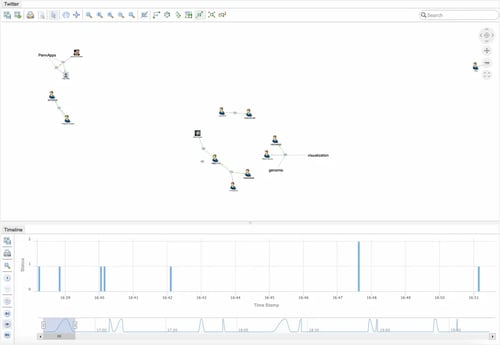
Synchronized data visualizations support the discovery of actionable insights.
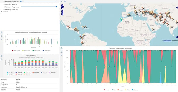
Example graph application showing earthquake data.
Graph and data visualization best practices
Graph and data visualization can be daunting if you are new to the concept and thinking about including data visualizations as part of your digital transformation or data analysis initiative.
There are a number of aspects you should consider as you start down this path:
- What is the best and most intuitive way to visually and graphically represent your data?
- Is there a common mental image shared by the people who will be looking at the visualization?
- What do users want to gain from the data visualizations?
- Are there additional tools or information to help users draw meaningful conclusions from the visualizations?
We help our customers navigate these questions and more, nearly every day.
Graphics Specialized for Your Graph Data Application
Perspectives is optimized with high-speed graphics capabilities and HTML5 canvas graphics to create the best in class graph visualizations for your application. You can use Perspectives HTML classes embed the visualization components into your web application and when the HTML class is assigned to any HTML tag, such as <span> or <div>, the tag will be interpreted as a component, regardless of its type.
Drive decision-making with Tom Sawyer Perspectives data visualization software
The Perspectives graph platform meets data visualization challenges with its suite of powerful, customizable, and interactive data visualization capabilities that have graph technology at their core.
Perspectives is a low-code application development platform that incorporates our decades of experience in solving complex graph and data visualization problems for enterprises across a variety of industries. Using Perspectives, developers can build custom graph visualization and analysis applications to meet their unique use cases.
Perspectives is highly performant for complex, big data. It includes:
- Seven data visualization view types
- Synchronized interaction across views
- Model-, data-, or rule-driven views
- Data edit and update tools
- Intuitive dashboard layout design tool
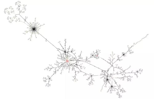
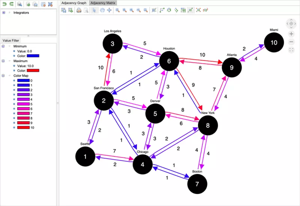
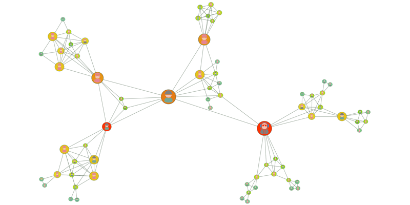
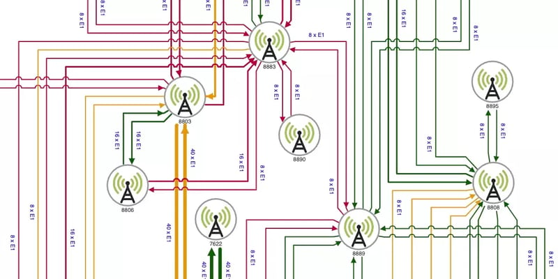
Drawing Views
Drawing views contain interactive visualizations of nodes, edges, connectors, edge decorations, labels, swimlanes, swimlane pools, and nested drawings. Drawing views support automated layout, link navigation, analysis, selection, zooming, scrolling, editing, and many other interactions.
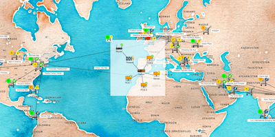
Map Views
Map views show geospatial information for the data elements. Supported environments include Tom Sawyer Maps for tightly integrated graph visualizations; OpenLayers for OpenStreetMap, Apple Maps, and Mapbox compatibility; and Google Maps.
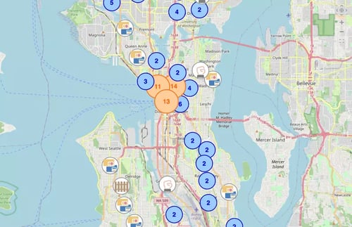
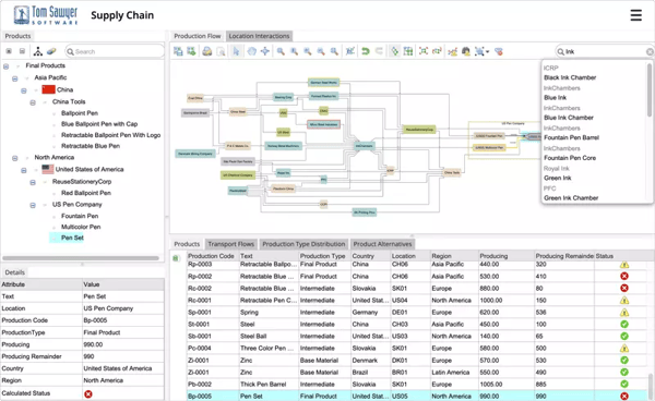
Table Views
Table views represent graph data in a tabular format with each row representing a model element and each column representing attributes of that element.

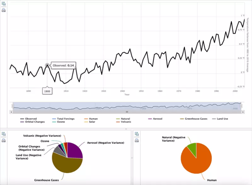
Chart Views
Chart views display information in the form of graphs or diagrams. Supported chart view types include: area chart, area spline chart, bar chart, column chart, line graph, pie chart, and spline chart visualizations for graphs.
Tree Views
Tree views show model elements with an interactive, collapsible hierarchical tree structure.

Timeline Views
Timeline views reveal how data changes over time. This view type supports visualization of data elements being added or deleted, or a snapshot of data for a specific period of time.
Inspector Views
Inspector views reveal the attribute details for an element that is selected in a different view. The choice of which attributes to show can be static, dynamic at runtime, or schema-defined.

Annotations Views
Annotations views add rich, contextual notes directly to nodes and edges in graphs capturing context and supporting analysis directly within visualizations.

For each view in your application, you select the relevant domain, which is a collection of model elements with filter-style conditions. Choose from the set of all nodes, set of all edges, and a domain for each model element type.
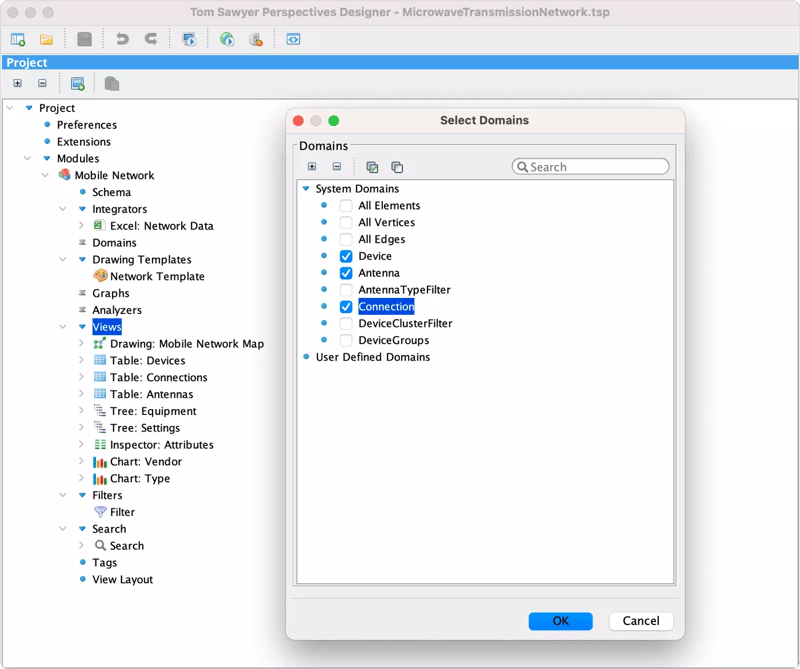
View domain options in Perspectives.
Enable exploration of data
Empower end users of your applications with capabilities to explore their data visualizations to maximize insights.
Expose filter controls and enable search in your end-user application.
Filters
Filters define the part of a model to be considered by integrators and views.
Search
The search functionality lets users search for model elements in one or more views.
Create powerful data visualization dashboard layouts with Perspectives
With Perspectives, you can design modern, effective dashboard-style layouts of your data visualizations in minutes. The intuitive, drag-and-drop interface allows you to quickly assemble a dashboard of views for your Perspectives end-user application. Add any number of views, in nearly any configuration. Add split panels and tab panels, and control their relative size.
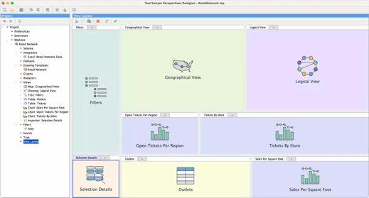
The Perspectives view layout editor.
Try these hands-on, interactive data visualization applications
Integrate with third-party components using RESTful APIs
When integrating your Perspectives-built application with third-party components, you can use RESTful APIs to access model elements.
A REST view exposes the methods for easy access.

Exposed RESTful APIs.